Gameplan Performance
Gameplan is a sports-tech platform designed to support clinicians, coaches and athletes through smarter injury management and performance tracking. Operating in a space dominated by clinical, overly technical branding, Gameplan needed an identity that felt credible and intelligent without losing its human edge. The challenge was to create a brand that could speak fluently to medical professionals while remaining accessible, modern and clinician-focused.
Brand Strategy
Brand Identity
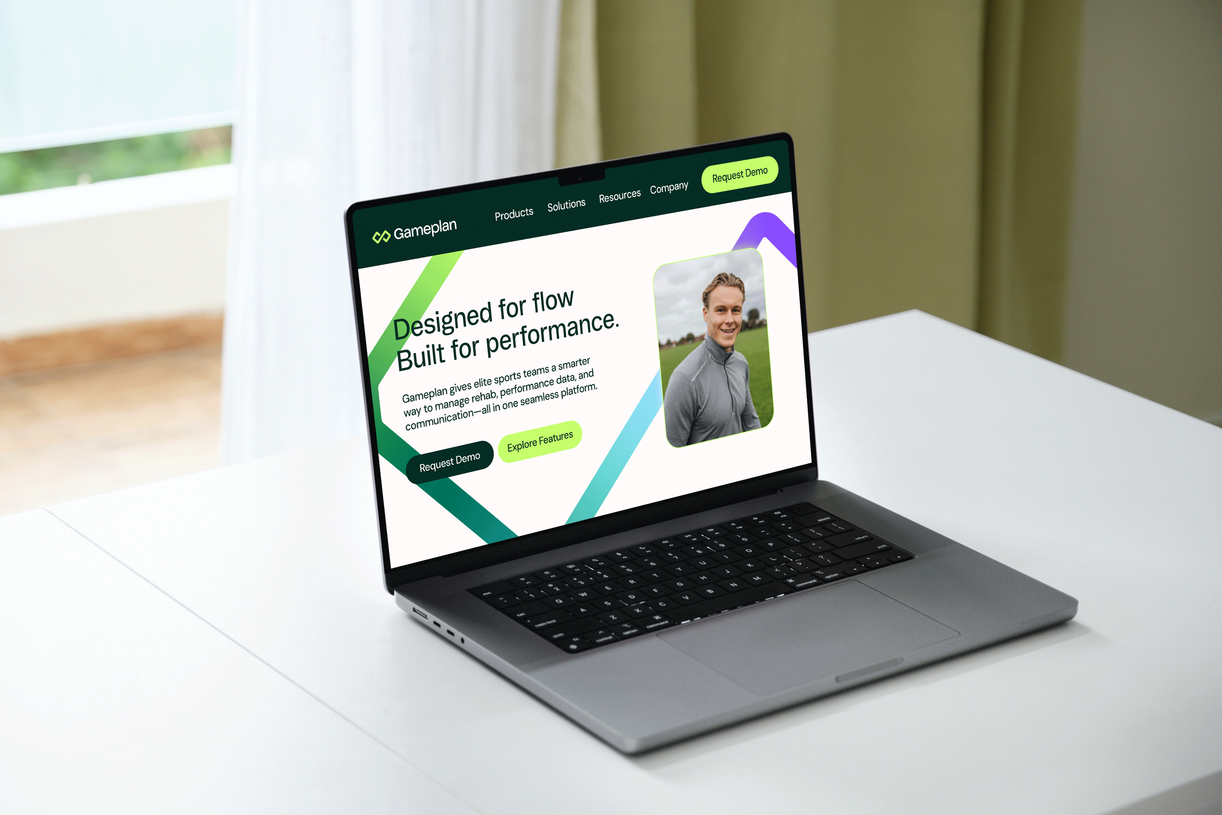
Website
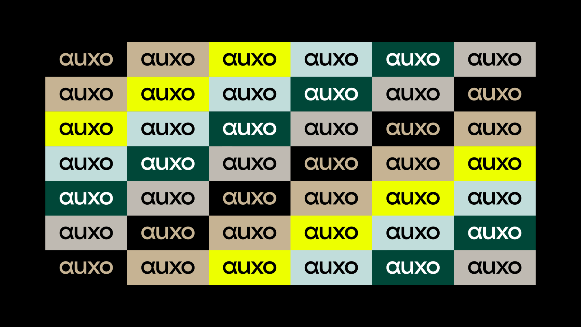
Logo
Art Direction

01
The Challenge
The sports performance and medical software landscape is crowded with systems that prioritise data over experience. Gameplan required a brand that:
- Built trust with clinicians and practitioners
- Felt modern and progressive, not cold or institutional
- Scaled across a growing digital platform
- Reflected collaboration, movement and progress
The identity needed to support a complex product while remaining simple, flexible and intuitive.
02
The Approach
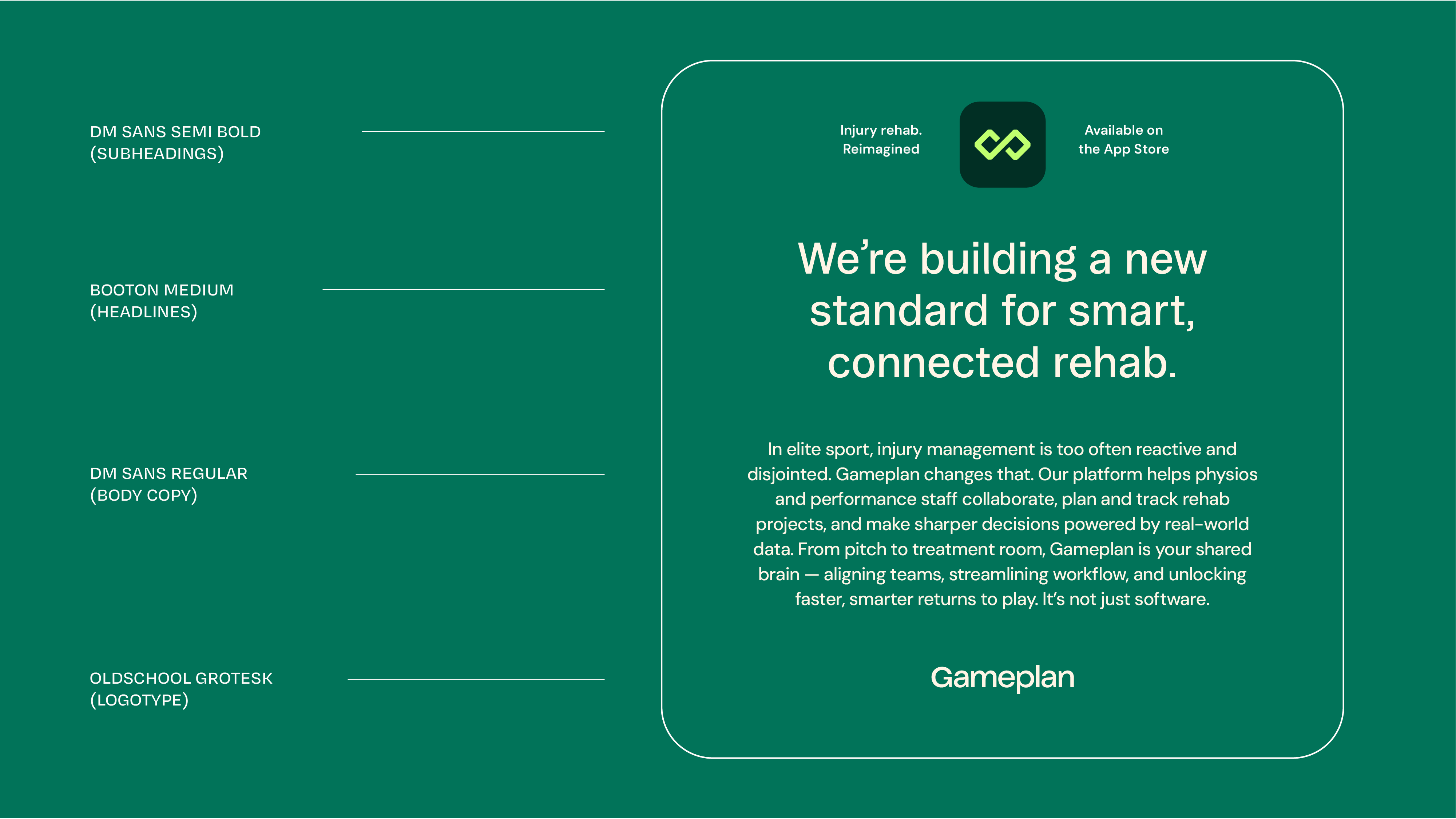
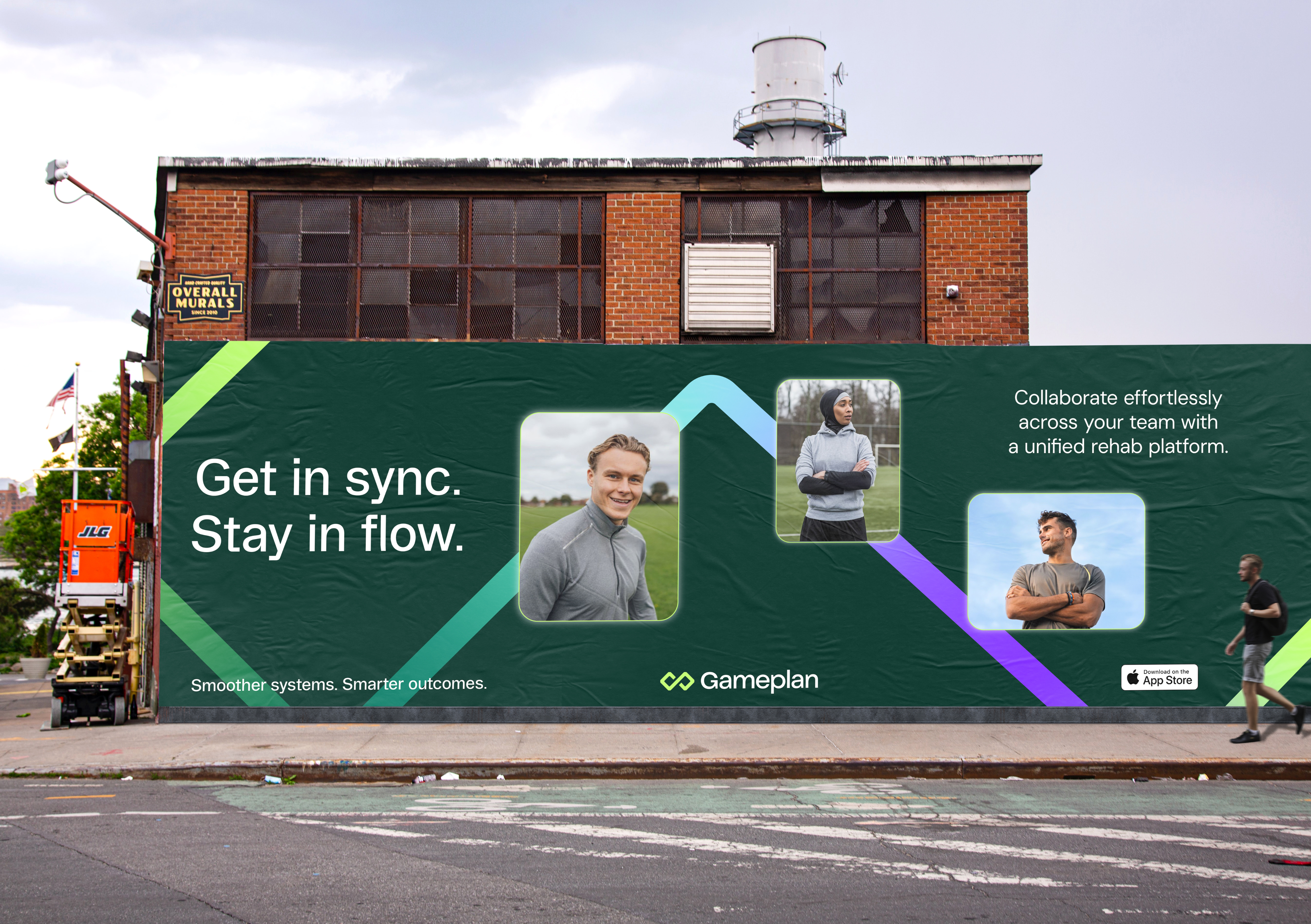
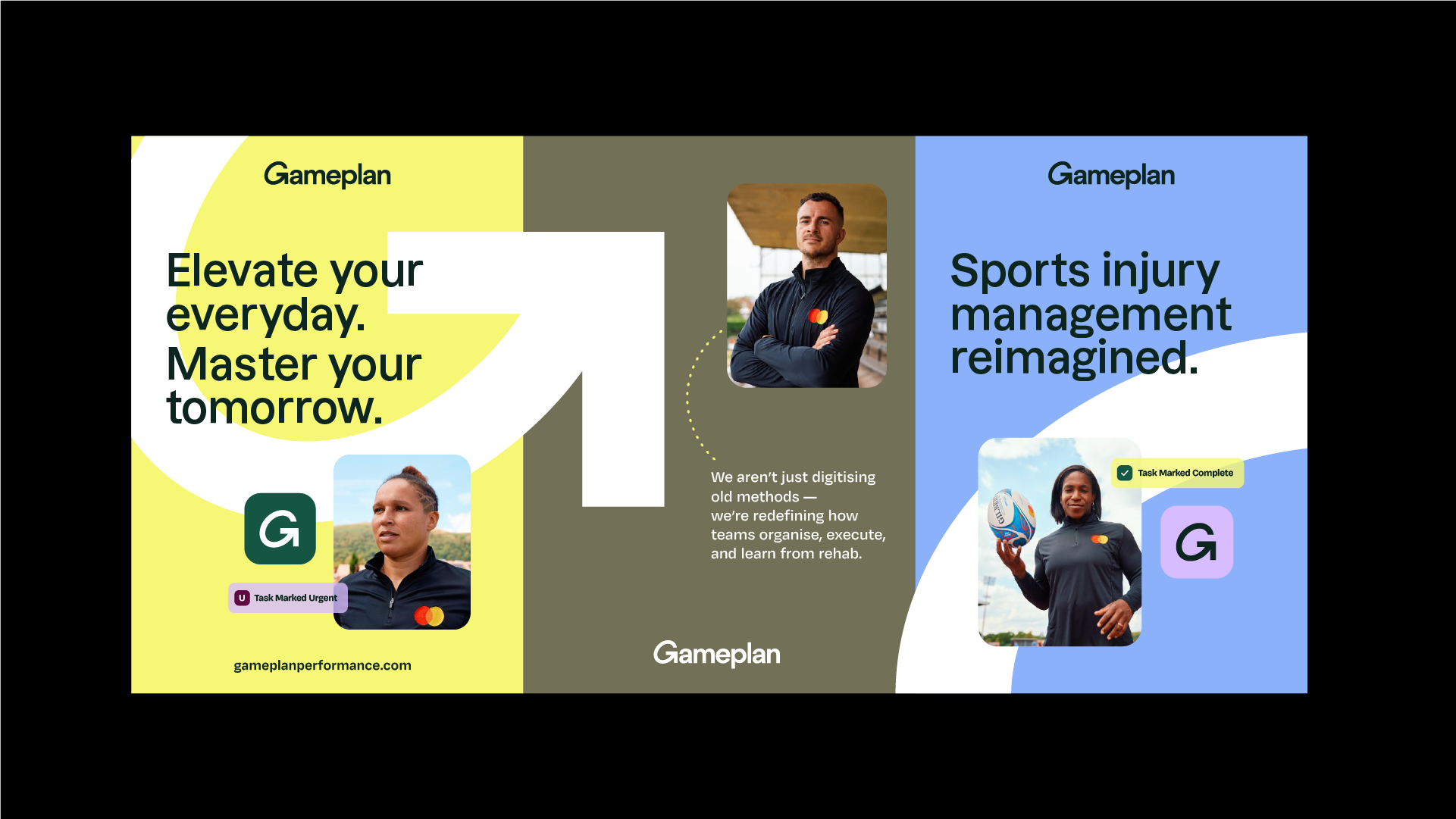
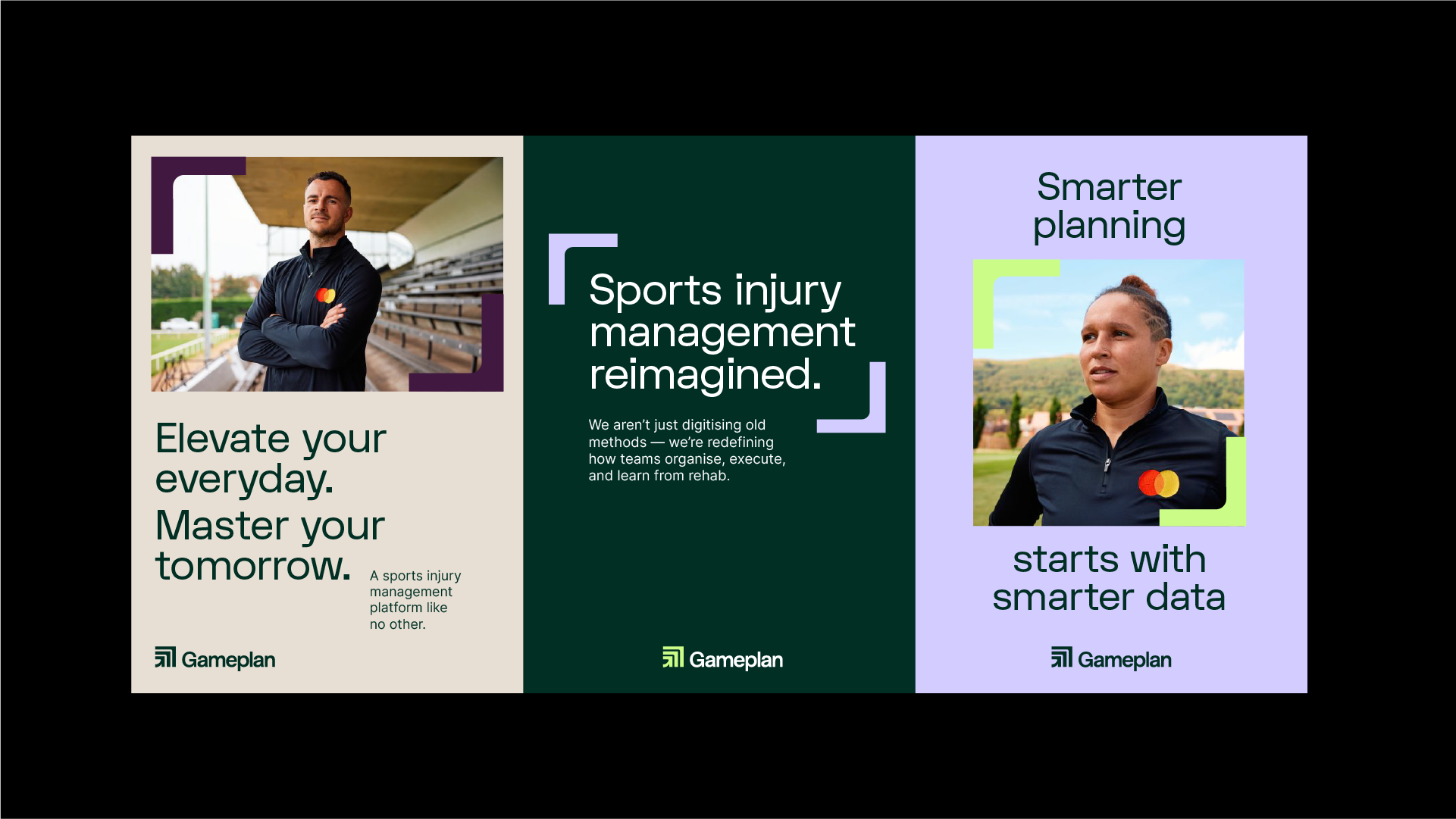
The brand was built around the idea of flow with the movement between injury, recovery and performance. A clear visual system was developed to balance clarity with energy, combining strong typographic structure, considered use of colour and a modular graphic language that could flex across product, marketing and content.
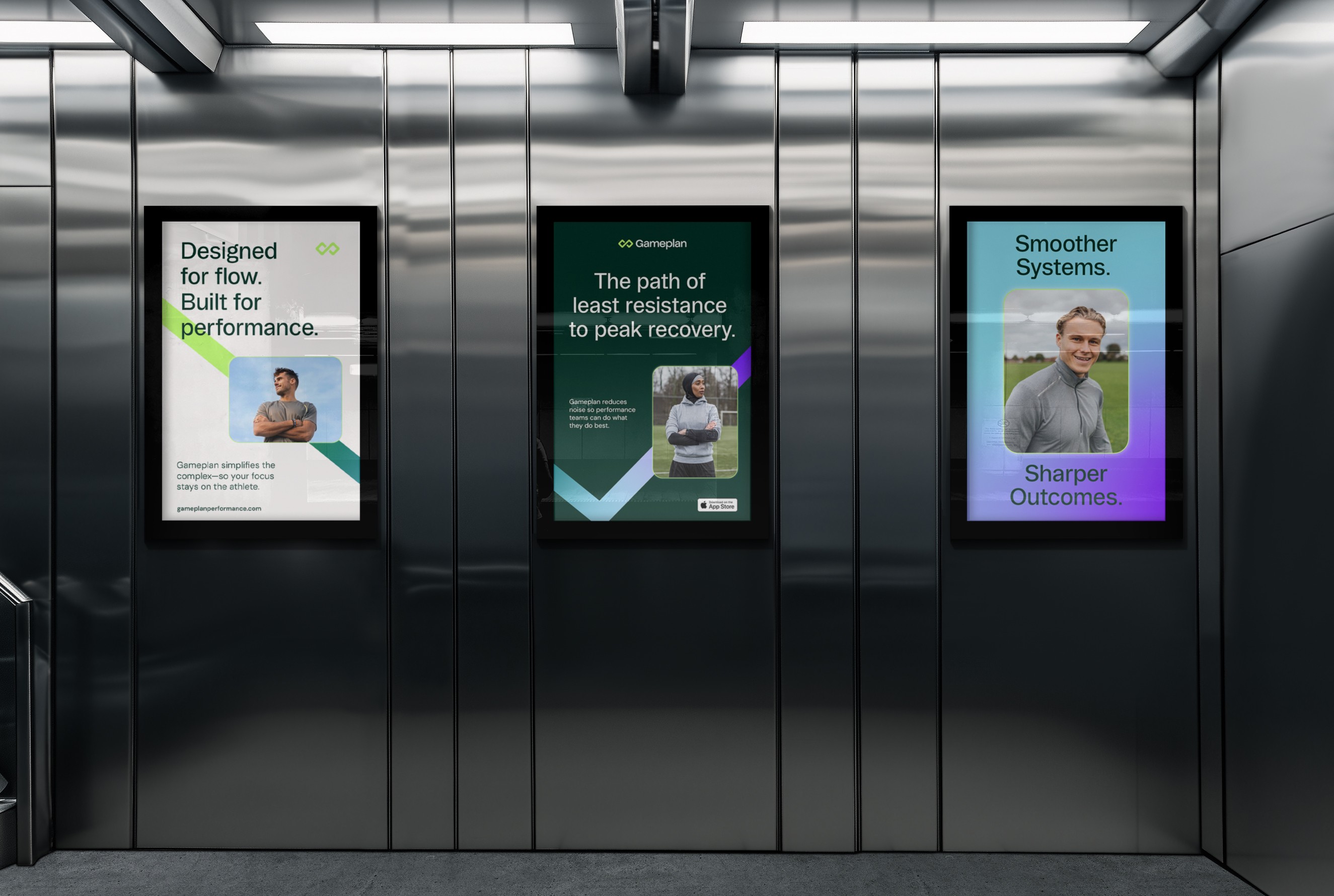
Art direction focused on realism and motion, grounding the brand in real athletes and practitioners rather than abstract performance tropes.
03
The Identity
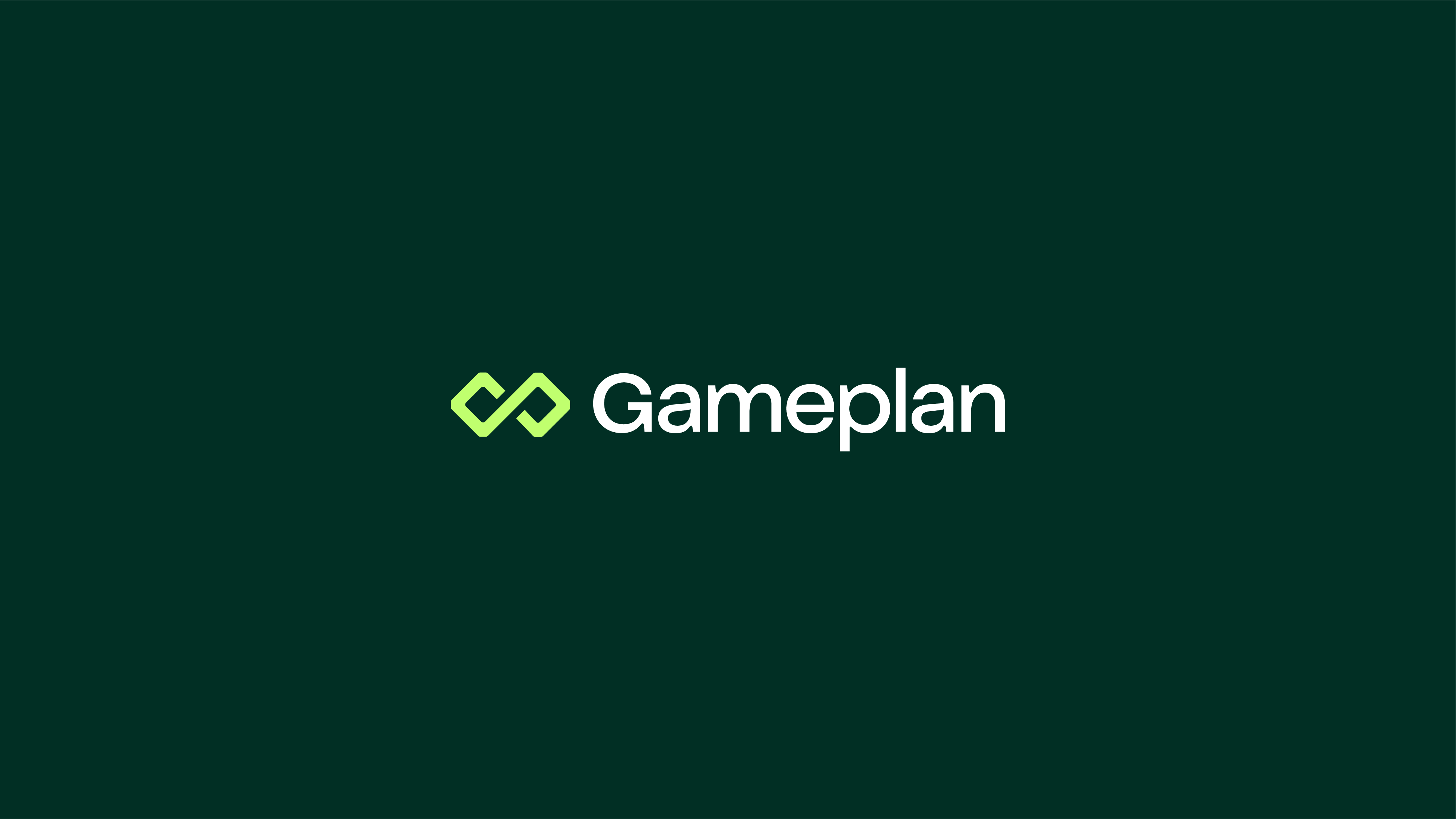
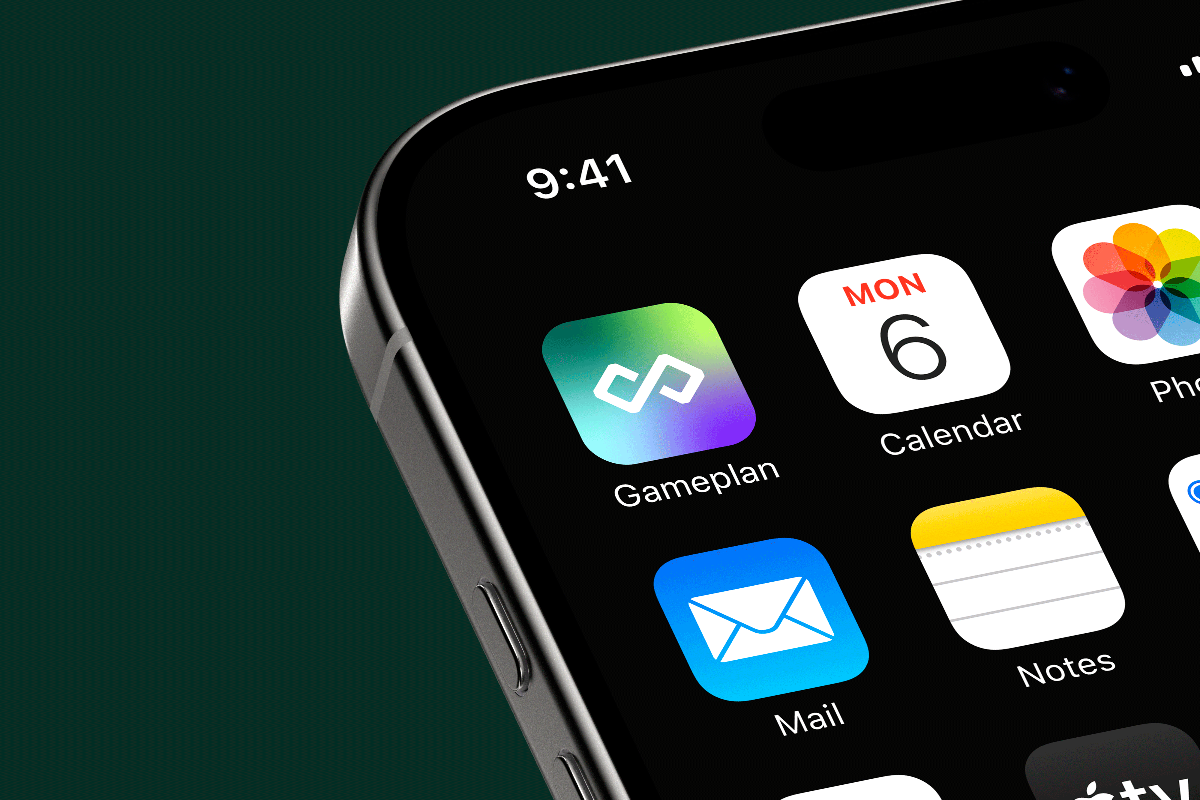
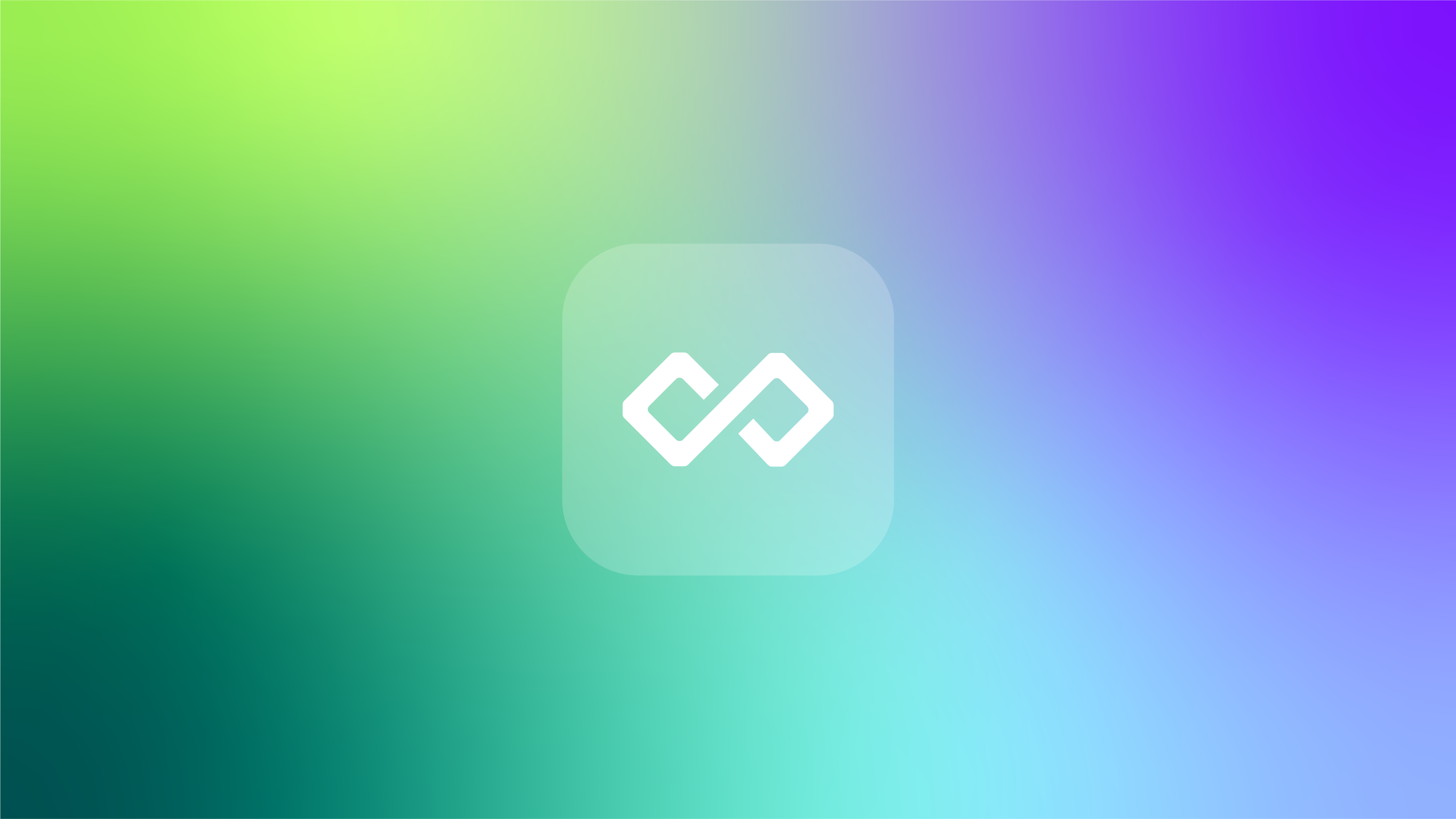
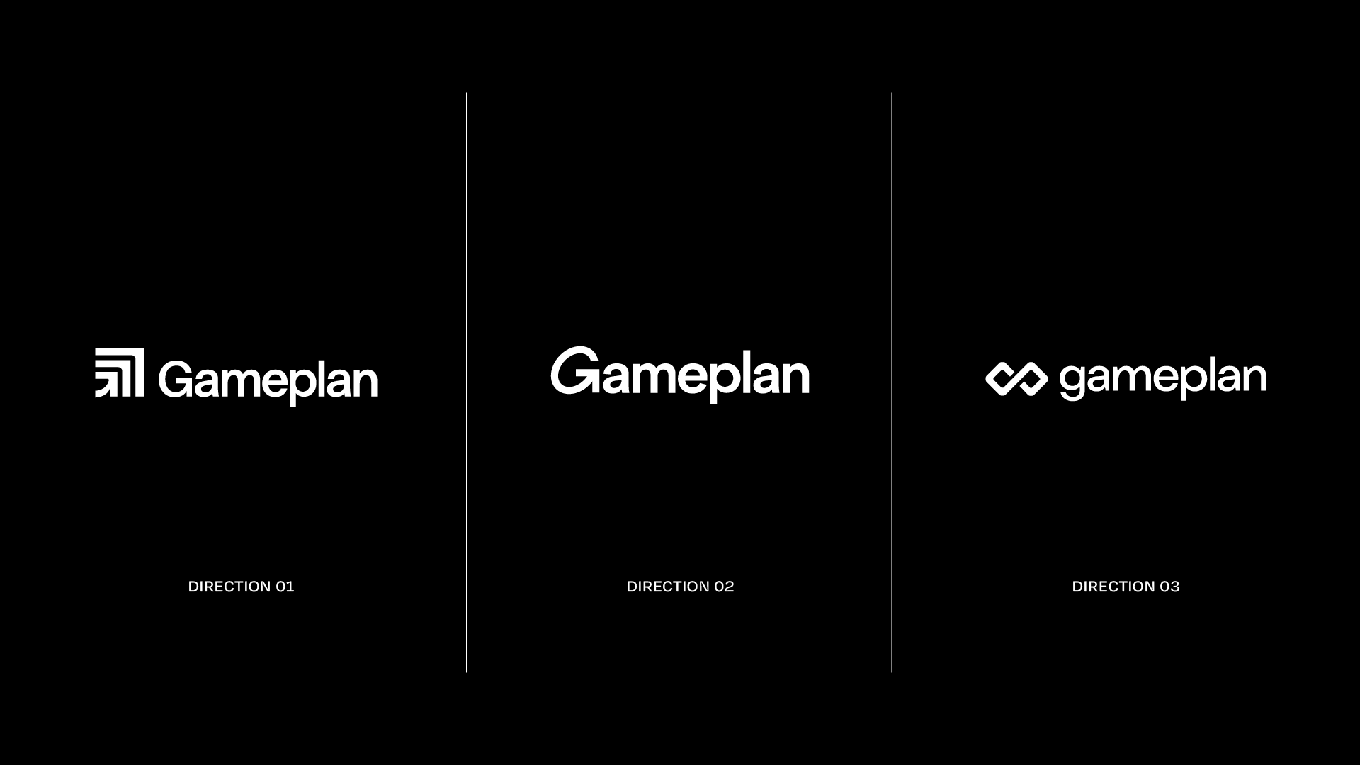
The logo mark and supporting graphic elements were designed to feel precise yet fluid, echoing both structure and progression. The flowing, interlocked shapes of the logo mark resemble a subtle infinity symbol suggesting limitless potential, ongoing progress, or a continuous cycle of improvement. A modern typographic system supports clarity across digital interfaces, while the colour palette introduces warmth and distinction within a traditionally sterile category.
The resulting identity positions Gameplan as confident, credible and forward-thinking. It’s a brand built for performance, but driven by people.
Deliverables
- Brand strategy
- Brand identity system
- Logo and visual language
- Art direction and photography guidance
- Digital brand application
- Brand guidelines
Concept Development

Other Projects
See Project
→
See Project
→
See Project
→
Naomi Beth Chilton

CONTACT
+447587870683
hello@naomichilton.co.uk
Gameplan Performance
Gameplan is a sports-tech platform designed to support clinicians, coaches and athletes through smarter injury management and performance tracking. Operating in a space dominated by clinical, overly technical branding, Gameplan needed an identity that felt credible and intelligent without losing its human edge. The challenge was to create a brand that could speak fluently to medical professionals while remaining accessible, modern and clinician-focused.
Brand Strategy
Brand Identity
Website
Logo
Art Direction

01
The Challenge
The sports performance and medical software landscape is crowded with systems that prioritise data over experience. Gameplan required a brand that:
- Built trust with clinicians and practitioners
- Felt modern and progressive, not cold or institutional
- Scaled across a growing digital platform
- Reflected collaboration, movement and progress
The identity needed to support a complex product while remaining simple, flexible and intuitive.
02
The Approach
The brand was built around the idea of flow with the movement between injury, recovery and performance. A clear visual system was developed to balance clarity with energy, combining strong typographic structure, considered use of colour and a modular graphic language that could flex across product, marketing and content.
Art direction focused on realism and motion, grounding the brand in real athletes and practitioners rather than abstract performance tropes.
03
The Identity
The resulting photography and video assets became the foundation of the ONEPWR sub-brand rollout, supporting packaging, digital platforms, retailer content, press and social media.
The work helped reposition VAX with a more contemporary and aspirational visual language, while remaining grounded in everyday use.
Deliverables
- Brand strategy
- Brand identity system
- Logo and visual language
- Art direction and photography guidance
- Digital brand application
- Brand guidelines
Concept Development

Other Projects
See Project
→
See Project
→
See Project
→
Naomi Beth Chilton
CONTACT
+447587870683
hello@naomichilton.co.uk
Gameplan Performance
Gameplan is a sports-tech platform designed to support clinicians, coaches and athletes through smarter injury management and performance tracking. Operating in a space dominated by clinical, overly technical branding, Gameplan needed an identity that felt credible and intelligent without losing its human edge. The challenge was to create a brand that could speak fluently to medical professionals while remaining accessible, modern and clinician-focused.
Brand Strategy
Brand Identity
Website
Logo
Art Direction

01
The Challenge
The sports performance and medical software landscape is crowded with systems that prioritise data over experience. Gameplan required a brand that:
- Built trust with clinicians and practitioners
- Felt modern and progressive, not cold or institutional
- Scaled across a growing digital platform
- Reflected collaboration, movement and progress
The identity needed to support a complex product while remaining simple, flexible and intuitive.
02
The Approach
The brand was built around the idea of flow with the movement between injury, recovery and performance. A clear visual system was developed to balance clarity with energy, combining strong typographic structure, considered use of colour and a modular graphic language that could flex across product, marketing and content.
Art direction focused on realism and motion, grounding the brand in real athletes and practitioners rather than abstract performance tropes.
03
The Identity
The logo mark and supporting graphic elements were designed to feel precise yet fluid, echoing both structure and progression. The flowing, interlocked shapes of the logo mark resemble a subtle infinity symbol suggesting limitless potential, ongoing progress, or a continuous cycle of improvement. A modern typographic system supports clarity across digital interfaces, while the colour palette introduces warmth and distinction within a traditionally sterile category.
The resulting identity positions Gameplan as confident, credible and forward-thinking. It’s a brand built for performance, but driven by people.
Deliverables
- Brand strategy
- Brand identity system
- Logo and visual language
- Art direction and photography guidance
- Digital brand application
- Brand guidelines
Concept Development

Other Projects
See Project
→
See Project
→
See Project
→
Naomi Beth Chilton

CONTACT
+447587870683
hello@naomichilton.co.uk